In the world of high-end fashion, the use of understated and refined hues reflects a subtle and sophisticated communication strategy, while also raising questions about the environmental impact of dyeing processes.
In the creation of a garment, color often comes first, taking precedence even over the cut, fabric, or silhouette. It creates the initial impression. This visual instinct explains why certain shades instantly convey a chic, controlled, and decidedly luxurious look. This chromatic vocabulary, though ambiguous, speaks to aesthetics while revealing deeply ingrained social codes.
A palette that soothes the eye
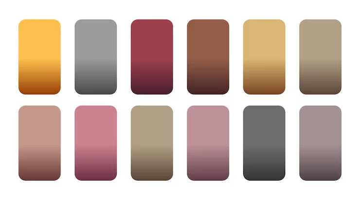
The most compelling colors don’t need to shout. They steer clear of bright primaries or overly saturated hues, inviting the eye to linger on softer shades: camel, ivory, charcoal, navy blue, chocolate brown, sage, and deep burgundy. The strength of these hues lies in their absolute simplicity. They seem chosen with intention, rather than dictated by trends.
What the eye picks up on first is not a piece’s label, but the subtlety and precision of its shade. A perfectly calibrated color conveys attention to detail, care, and a commitment to rigor. This mechanism largely explains the dominance of dark or deep palettes in the luxury industry. Studies on high-end branding confirm it: rich hues, such as forest green or midnight blue, are favored for their ability to evoke trust and rarity.
Camel, ivory, and charcoal: the power of these chosen shades
Camel remains one of the most effective visual shortcuts in the wardrobe. It immediately evokes the historic houses that have made understated elegance their signature. Its execution, however, demands absolute precision: if it leans too much toward orange, it loses its nobility; if too pale, it loses its depth. On an exceptional fabric, however, it takes on an almost architectural dimension.
Ivory follows the same logic. More sensual than optical white, it gives the impression of a garment chosen with rare discernment. Conversely, a white that is too bright often veers toward the utilitarian or uniform. Charcoal, meanwhile, offers an alternative to black: less harsh, more subtle, it gently catches the light and flatters the facial features.
Visual luxury does not shout; it modulates. A philosophy that runs through and defines this entire palette.
Navy blue and chocolate brown: new classics
Navy blue stands out as a safe bet, navigating with agility between authority and discretion. It carries the sartorial heritage of blazers and club jackets. Without the severity of black, it brings undeniable depth and structures the silhouette without making it stiff.
Chocolate brown, once shunned by the runways, has regained its prestige, driven by the resurgence of distinct earthy tones in recent seasons. Here, fabric quality reigns supreme: a beautiful brown is dense and warm, while a poor-quality material will quickly make it look dull. These two shades pair beautifully with neutral basics, creating a subtle presence and quiet elegance, far from any flashy allure.
Sage, olive, and burgundy: understated elegance
The most refined greens aren’t necessarily the brightest. Muted sage and olive infuse a natural sophistication without seeming overly calculated. Their visual softness breaks down the rigidity of a formal silhouette while offering an unexpected alternative to the usual grays and beiges.

 Burgundy, or oxblood, follows this same approach. More subdued than a bright red, it retains the richness of its original pigment without veering into the aggressive. As an accent on a beautifully crafted bag, shoes, or a leather belt, it adds depth to a minimalist outfit. Historically, these hues are associated with objects that stand the test of time: fine bookbindings, weathered leather, wood paneling. They embody timelessness, the ultimate hallmark of distinction.
The paradox of dyeing: nuance versus ecological demands
Yet there is an inherent paradox in this aesthetic: these refined colors are among the most complex to produce cleanly. Conventional dyeing processes are indeed among the most polluting stages of the textile industry, contributing significantly to water contamination, as environmental reports regularly highlight.
Contemporary luxury aesthetics can no longer avoid reflecting on its own production. The use of unbleached fibers, plant-based dyes, low-impact processes, and naturally nuanced materials now makes it possible to achieve this visual simplicity without the ecological toll of traditional chemical baths. Soft tones thus transcend a mere stylistic choice to become a genuine challenge in manufacturing and innovation.
The Art of the Imperceptible
The anchor point of these hues lies in their ability to circumvent the obvious. A slight shift away from their primary color: ivory rather than white, charcoal rather than black, chocolate rather than standard brown, burgundy rather than vermilion. This minute variation is enough to establish an impression of absolute mastery.
However, this aura does not rest on color alone. A subdued shade applied to a mediocre fabric will remain lackluster. The same shade, draped in a fabric of excellence, is transformed. The hierarchy of clothing is relentless: while color captures attention, it is the cut, the drape, and the texture of the fabric that define the look.
The ultimate goal is not to display status, but to understand why, in both wardrobe and demeanor, restraint emerges as the most powerful language. In an era saturated with visual effects, subtlety offers an invaluable luxury: that of not having to raise one’s voice to be memorable.