
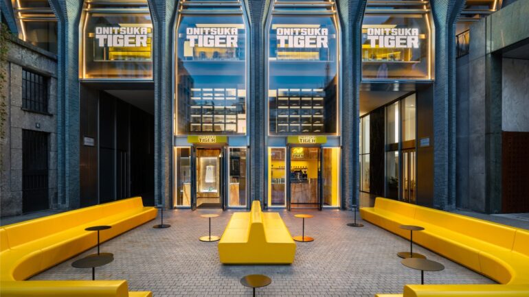
A yellow terrace on Piazza Liberty: this may be where Onitsuka Tiger’s Milanese ambition is most evident. Even before the clothing or shoes, there’s this way of occupying the space, of offering a reason to stop by that isn’t necessarily a purchase. With its new flagship store—the brand’s second location in Milan—the Japanese label elevates the café to more than just a side attraction. Inside, fashion takes center stage; outside, it seeks its place in the city’s daily life. This approach deserves to be viewed as more than just another store.
The Café: Another Point of Entry
Located on the ground floor, the Onitsuka Tiger Café extends the store out into the outdoor space of Piazza Liberty. Its terrace features the brand’s signature yellow, serving as a recognizable symbol that doesn’t need to be displayed on clothing. The concept is simple and clear: to take the visual identity beyond the confines of the storefront and bring it into a space where people can sit down. The flagship store is thus experienced through two distinct rhythms: that of the shopping journey and the more relaxed pace of taking a break.
To design this café, Onitsuka Tiger enlisted Kazoku Studio, a Milan-based consulting firm specializing in food and beverage. The menu combines sweet and savory offerings with a selection dedicated to matcha and coffee. There’s no need here to turn this offering into a gastronomic manifesto. Its appeal lies instead in its role within the bigger picture: it brings to life the brand’s ambition to expand its universe beyond clothing. Having a coffee becomes a way to visit the location without having to try on clothes first.
The brand presents the space as a meeting place for different communities and perspectives. This is an intention, not yet a reality that architecture alone could guarantee. But the terrace provides a tangible foundation for it. It fosters a connection with the plaza, where a store might otherwise remain closed off within its collections and its own display design. The details matter: in this project, openness to the city takes on a physical form.
Bringing clothing together without blurring the lines
Inside, the selection offers a glimpse into what Onitsuka Tiger aims to showcase of its current identity. The runway collections designed by Creative Director Andrea Pompilio sit alongside contemporary footwear and Denivita, the line of denim manufactured in Japan. This juxtaposition is one of the flagship store’s key objectives. It invites visitors to consider the various clothing offerings together, rather than limiting their visit to a single product category.
In particular, the presence of the runway collections provides the creative direction with a permanent framework, distinct from the fleeting moments of their runway presentations. As for Denivita, its inclusion in the same space brings Japanese denim into this broader interpretation of the brand. The store thus offers an opportunity for comparison: to understand how pieces from different lines come together to form a unified offering. This is another purpose of a large boutique, when its size allows for highlighting nuances rather than simply increasing the number of items.
The Nippon Made collection, meanwhile, benefits from a specific location on the mezzanine, in an atmosphere described as more intimate. This relative separation avoids placing all the lines within an undifferentiated setting. This choice is interesting because it introduces a change of scale within the shopping experience. The flagship store’s expansive layout is counterbalanced by a more intimate space dedicated to a specific series. The overall identity, therefore, does not require every collection to be presented in the same way.
Yellow Put to the Test by Materials
The architectural concept goes by the name “Yellow Concept,” but its success depends on more than just the use of a single color. Entrusted to Studio Dini Cataldi, the project is housed in a building considered one of the landmarks of Milanese architecture. The two-level layout must therefore balance a very assertive brand identity with a setting that has a presence all its own. Yellow serves as the unifying theme; the materials and variations in ambiance prevent it, in principle, from becoming a mere solid color.

On the ground floor, yellow marble is paired with a dark terrazzo floor. This is the most striking detail of the chosen design language. The color does not merely appear as a surface treatment here: it permeates the stone, while the floor introduces a contrast. Onitsuka Tiger sees this combination as a dialogue between Italian materials and Japanese minimalism. While this statement falls under the brand’s marketing narrative, it is grounded in identifiable design choices that can be examined beyond the stated intent.
Upstairs, yellow takes on a more dominant role, and the color scheme becomes more intense. The journey through the space is therefore not based on a uniform atmosphere. Between this more expressive level, the ground floor structured by materials, and the mezzanine reserved for Nippon Made, the project organizes several degrees of presence. This is its architectural focus: providing continuity without erasing differences, making the brand recognizable without subjecting every space to the same effect.
In Milan, an identity that takes center stage
The choice of Piazza Liberty, in the center of Milan, gives this opening special significance. Onitsuka Tiger already had a retail location in the city. This second location introduces a format where the collections, architecture, and café all contribute to a unified presentation. The location serves not only to expand the brand’s commercial presence but also allows it to showcase its world across multiple dimensions, from apparel to hospitality.
This development occurs within an institutional context distinct from the Milan project. Despite the independence agreement signed last June, Onitsuka Tiger still belongs to Asics. It would therefore be premature to interpret this opening as evidence of fully achieved autonomy. On the other hand, the flagship store showcases a distinct identity, driven by Andrea Pompilio’s creative direction and an immediately recognizable spatial language. This distinction is important: a brand’s expression and its legal structure are not one and the same.
It remains to be seen how this space will be used. The promise of connection will not be realized through the concept’s name or the decor’s consistency alone, but through the habits that may develop there. In this regard, the café offers the most tangible vantage point for the project: on the ground floor, a menu featuring matcha and coffee; on Piazza Liberty, a yellow terrace opening onto the public space.