
Make Texture a preferred source on Google to support us
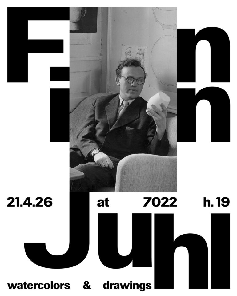
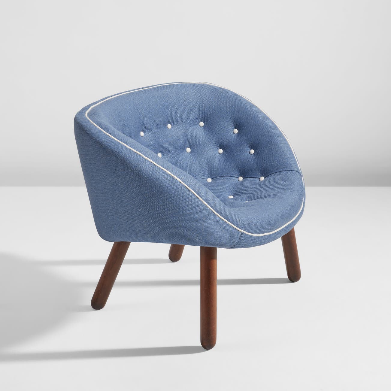
Add Texture to GoogleFinn Juhl’s home, built north of Copenhagen in the municipality of Ordrup, stands as a testament to architectural independence. At just thirty years old, the Danish designer brought his own vision of domestic space to life here by orchestrating a meticulously crafted fusion of wall structure, visual arts, and furniture. Over the decades, this home has become a sanctuary of Nordic modernism, a sanctuary where the seminal pieces of his 1940s aesthetic vocabulary take center stage. The organic curves of the Poet Sofa, the masterful seat of the Chieftain Chair, and the meticulous marquetry of the Judas Table define an ideal of warmth and fluidity. Design history has largely remembered this sculptural softness, sometimes capturing Juhl’s work in a reassuring elegance. Yet the firm’s archives concealed an infinitely more complex interior design, hidden from public view: the bedroom intended for his partner, Hanne Wilhelm Hansen.
A Breakthrough in the Parisian Landscape
Long overlooked in major retrospectives, this private collection designed in 1961 disrupts the linear chronology of the master’s work. The publisher House of Finn Juhl has decided to relaunch production of this unique collection, an initiative that resonates particularly well with the cultural calendar. Unveiled in Paris during Paris Design Week, the furniture has taken over the Triode Design gallery for a temporary exhibition running from September 10 to October 24, 2026. The installation brings together the original elements of the piece: a majestic bed, two armchairs, a small side table, and a specialized cabinet designed for storing gloves.
The visual impact of this revival stems from the distance Juhl has suddenly created from his own legacy. Twenty years after establishing his continuous lines and contoured armrests as the standard for postwar comfort, the designer has turned his back on his established style. The design created for Hanne Wilhelm Hansen abandons the enveloping function in favor of an abrupt frontal presence. The composition plays on the clash of materials and shades with a sharpness that resembles a radical statement more than a simple search for decorative harmony.
A Break with Tradition Through Steel and Pigment
One of the two chairs in the set, the Television Chair, epitomizes this change of direction. Here, Juhl abandons organic fluidity to venture into the realm of strict geometry. The chair is built around a bold cylindrical form, supported by a structure that forces the wood to interact with the steel. The incorporation of bare metal marks a deliberate break with the dogma of traditional Scandinavian cabinetmaking, which has traditionally been committed to the exclusive use of solid wood. The formal treatment of the seat imposes a sharp, almost nervous graphic quality that disconcerts with its rejection of customary courtesy.
The radical nature of the design extends beyond the metal frame. A watercolor from the designer’s personal archives documents the original vision for this armchair. Juhl had sketched it covered in a spectacular pigment: a particularly vibrant Thai red. The introduction of this flamboyant hue into the heart of the Ordrup home reflects a deliberate openness to outside influences. The designer looks beyond Scandinavian borders. He draws on distant references to challenge the chromatic conventions of his time and infuse the home’s intimate spaces with a new, almost defiant energy.
Intellect in the Alcove
The Wilhelm Hansen bed, which serves as the focal point of the entire room, extends this logic of contrasts. The piece is built on a strict hierarchy of wood species. The main frame showcases the warm richness of cherry wood, punctuated by dark wenge accents, while a concealed pine frame ensures the structural integrity of the interior. The piece’s presence in the space oscillates between functional restraint and genuine sculptural density.
The bed’s originality, however, lies in its use of color. The side panels, the headboard, and the footboard—adorned with a unique teardrop-shaped motif—incorporate flat areas of paint directly inspired by Goethe’s nineteenth-century theory of color. Drawing on a treatise on optical perception to design a piece of furniture for rest was a risk. Juhl could have fallen into scholarly pretension, producing a coldly conceptual object. He avoids this pitfall by treating color with a sensitivity that defuses any academic rigidity.
Dissonance as a Principle of Harmony
The glove cabinet, the final element in this arrangement, reveals the method by which the designer succeeds in tying the whole ensemble together. The drawer fronts of this small storage unit echo the painted surfaces of the bed frame. The hues respond to one another from one end of the room to the other without ever becoming trapped in a system of symmetrical repetition. Juhl’s approach rejects uniformity, which he undoubtedly perceives as an aesthetic shortcut. The visual balance of the bedroom is built upon subtle variations, creating a network of asymmetrical correspondences that keeps the eye engaged.
Recreating a Personal Narrative
The reissue project led by House of Finn Juhl goes beyond the mere logic of capitalizing on heritage. By rescuing these pieces from oblivion, the publisher acknowledges the darker aspects and complexities of its own catalog. This approach illustrates a clear commitment not to reduce the designer’s legacy to his most commercially successful pieces, but to engage with it in all its contradictions. The 1961 collection stands out as a space of formal freedom where furniture shifts from the status of a utilitarian object to that of an intimate expression.
Today’s market for historic design frequently succumbs to a form of blissful contemplation, smoothing out works from the past to blend them into standardized interiors. The Hanne Wilhelm Hansen bedroom offers direct resistance to this trend. It refuses to conform to the staid aesthetic all too often associated with postwar modernism. The piece serves as a reminder that Finn Juhl mastered the art of spatial tension with as much skill as he did that of physical comfort. The angles, the steel, and the red pigment reflect a rebellious spirit, one capable of sacrificing the politeness of a line to materially convey a story of independence and affection.