
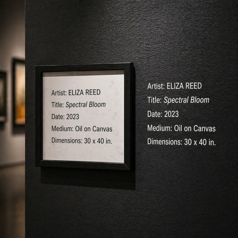
In the subdued dim light of galleries or under the overhead lighting of major institutions, a familiar figure catches the eye: that of the visitor leaning forward, their neck bent at an unlikely angle, trying to decipher a tiny block of text affixed twenty centimeters above the floor or lost in a shadowy corner. This small rectangular piece of cardboard, known in museum jargon as a label, has become the weak link in the aesthetic experience. While exhibition designs are becoming increasingly spectacular and art is displayed with the help of immersive technologies, the writing of these labels seems to have remained stuck in an academic austerity that, far from illuminating the work, often ends up obscuring it. The conclusion is clear: exhibition texts are in the midst of a profound crisis, and it is time to radically rethink how we address the viewer.
The problem lies not only in the font size or the physical placement of these labels. It is structural. All too often, exhibition labels are written by specialists for other specialists, using a cryptic vocabulary that acts as an invisible barrier. They contain dates, complex techniques, and historical context that is sometimes so dense that it discourages the viewer rather than inviting them in. The visitor, weary from “museum fatigue” — that syndrome of cognitive exhaustion well known to curators — ends up skimming these blocks of text without retaining the essentials, or worse, gives up reading altogether so as not to interrupt the emotional flow they experience when facing the artwork.
Journalistic Methods in the Service of Art
To break this deadlock, a solution is beginning to emerge—one borrowed not from art history but from newsrooms: the inverted pyramid. This journalistic writing technique involves placing the most crucial, most impactful information right at the beginning of the text. Instead of beginning with the artist’s date of birth or a tedious chronology of influences from the Flemish school, the label should open with the very reason why this work deserves our attention. Why did this painting cause a scandal? How did this sculpture revolutionize the use of negative space? What primal emotion did the artist seek to capture?
Applying the inverted pyramid to the museum means acknowledging that the public’s attention span is a scarce resource. In a world saturated with images, the text must serve as a hook, not a chore. By placing “the essentials” at the top of the text, we allow visitors to instantly grasp the work’s significance. If they wish to delve deeper, they can continue reading down through the lower layers of the pyramid, where technical details, provenance, and secondary analyses are found. This hierarchy of information respects everyone’s freedom: those seeking a compelling anecdote are catered to, just as are those looking for a detailed structural analysis.
Breaking Out of the Semantic Bubble
The current decline of the “cartels” is also due to a tone that is often too distant, even condescending. Writing a gallery text is a balancing act. It involves making the content accessible without oversimplifying it, and being precise without being pedantic. The “sorry state” being criticized today highlights this chronic inability of institutions to translate academic knowledge into a vivid narrative. A successful caption should not merely describe what the eye already sees—“a figure sitting in a landscape”—but should instead offer a key to understanding that the image alone cannot provide.
The vocabulary used plays a decisive role here. The overuse of abstract adjectives and vague theoretical concepts creates a distance that distances the viewer from the work. Conversely, a narrative grounded in the concrete—highlighting a specific detail of the composition or a particular circumstance surrounding its creation—builds a direct bridge between the artwork and the viewer. This is not about turning the museum into an amusement park, but about recognizing that mediation is an act of generosity. The exhibition label should be a welcoming host, not a guard checking credentials at the entrance to the gallery.
The Aesthetics of Information
Beyond the content, the very form of the exhibition text deserves a design revolution. All too often, the label is treated as an afterthought—an administrative element placed wherever there is space left on the wall. Yet readability is an essential component of the overall experience. Typography, the contrast between the text and the background, and above all the height at which it is placed are factors that determine whether the information will be absorbed or ignored. Text placed too low forces the visitor into a physically submissive posture that is not conducive to contemplation; placed too far away, it forces the visitor into an exhausting back-and-forth gaze.
Integrating graphic design into the curatorial strategy is one of the most promising approaches to remedying these flawed texts. In some avant-garde institutions, we are seeing the emergence of color schemes that help distinguish different levels of interpretation, or layouts that follow the key lines of the exhibition design. The text thus becomes a visual element in its own right, guiding the viewer’s gaze without distracting it. This holistic approach views reading a label as an integral part of the rhythm of the visit, just like moving through the space or the lighting of the works.
Toward a Language of Curiosity
Finally, revamping museum labels requires rethinking the curator’s role. Curators must no longer be merely the guardians of historical truth but must become storytellers capable of sparking curiosity. The ultimate goal of a label is not to conclude the subject but to open it up. A good label is one that, after being read, prompts the visitor to look at the artwork again, for longer, and with renewed attention. It must pose questions as much as it provides answers.
This paradigm shift toward more direct communication, structured according to the principles of the inverted pyramid, does not imply a dimming of intellectual depth. On the contrary, it demands greater intellectual discipline: the ability to distill the essence of a complex subject and make it accessible to the widest possible audience. Ultimately, the success of a label is not measured by the number of words it contains, but by the spark of understanding it ignites in the mind of the person who pauses before it. The future of museums may well hinge on this—on those few square centimeters of text which, if well-crafted, can transform a simple stroll into a true intellectual encounter.
The stakes are high: to give the public back the power to understand without needing a specialized glossary at hand. If institutions succeed in transforming these “sorry states” into effective storytelling tools, they will have won their bet on cultural democratization. The label will then no longer be an obstacle to viewing, but rather the lens that finally allows one to see the artwork in all its clarity.