Make Texture a preferred source on Google to support us
Add Texture to GoogleThe gesture is mechanical, almost instinctive. A slight twist of the wrist, a downward glance, and the information is taken in. Yet, when faced with a high-end timepiece, this purely utilitarian reading often falls apart. What the eye deciphers—even before determining whether it is ten o’clock or noon—is a complex topography, a miniature landscape where every square millimeter serves a precise technical and aesthetic purpose. To truly grasp such an object, one must set aside the simple passage of time and linger on the terrain traversed by the hands. The surface of a watch acts like a face: it has its own grammar, its areas of shadow, its flashes of light, and its moments of silence. Decoding this language allows one to immediately understand the context in which the piece exists, its degree of refinement, and the precision of its craftsmanship.
Architecture and Spatial Landmarks
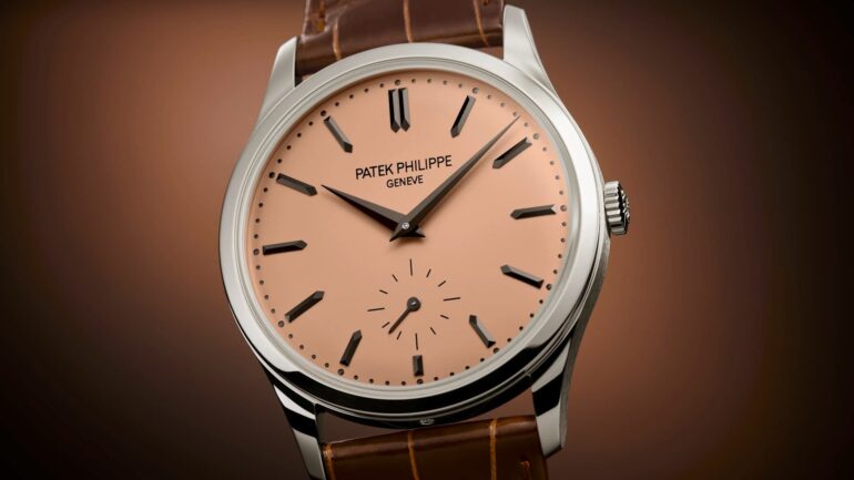
The structure of the dial is defined first and foremost by its hour markers—those silent beacons that punctuate the circumference of the circle. Their design dictates the character of the entire timepiece. Slender applied batons, hand-polished and faceted, reflect a sharp light. They form a strict geometric pattern, often associated with evening watches or so-called “form” pieces. Conversely, thickly painted Arabic numerals—sometimes coated with luminescent material—immediately anchor the watch in a more functional vocabulary, linked to onboard instruments, aviation, or scuba diving.
The presence of Roman numerals, meanwhile, stretches the space, imparting a classical verticality that evokes architectural clocks and centuries-old tradition. Interpreting this architecture means, above all, observing the tension between these markers and the empty space that separates them. Spacing, typographic choices, and the serifs of a numeral are never left to chance. These elements create visual balance, guiding the eye to move seamlessly from the periphery toward the central dial. The trained eye will linger on the precision of the minute track, and particularly on the railway-track pattern: this double notched line, which often encircles the dial, punctuates the space with the precision of an ancient measuring instrument, drawing a clear boundary between the movement and the case.
Material in the Grip of Light
Beyond the strict arrangement of temporal information, the very foundation of the dial demands careful interpretation. Watchmaking employs a vocabulary of textures whose primary function is to capture, sculpt, or absorb ambient light. A sunburst brushed finish features micro-stripes invisible to the naked eye, radiating from the center outward. Under direct light, the surface comes to life, creating light and dark areas that shift with the slightest movement of the arm. Reading the time becomes a kinetic experience, changing with the environment.
Enamel imposes a diametrically opposed logic: that of motionless depth. Whether crafted using the champlevé or cloisonné techniques, or fired at high temperatures using the grand feu method, this molten glass offers absolute and unalterable color density. Its glassy luster evokes ancient ceramics and freezes time. Here, observation takes place within the thickness of the material. The gaze plunges into a milky white or an abyssal black, without ever encountering a rough edge.
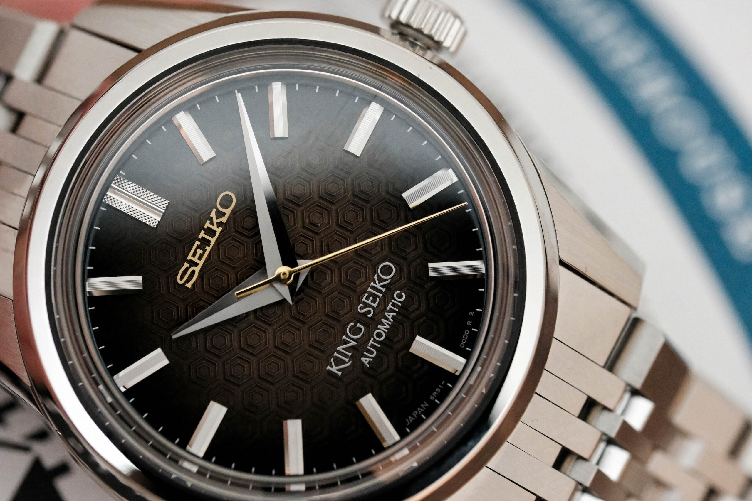
Guilloché engraving introduces a third physical dimension. These extremely dense geometric patterns, carved directly into the metal using a hand-turned lathe, transform the smooth surface into a three-dimensional network of tiny pyramids, waves, or rosettes. Deciphering a guilloché dial requires sustained attention: light catches on it and refracts, revealing a microscopic level of detail that is fully apparent only at close range, altering the perception of the base color depending on the angle of incidence.
Semantics and the Movement of the Hands
They remain the leading actors in this pocket-sized theater. Their shapes constitute a highly specific horological alphabet, capable of radically transforming the look of a watch. Sword-shaped or dauphine hands—characterized by a broad base and a tapered tip, often curved along their length—mark the passage of the hours with an almost martial authority. Their multifaceted profile allows for play on contrasts: one half catches the light while the other plunges into shadow, ensuring optimal readability even in dim lighting.
The leaf-shaped profiles, more organic and curved, glide over the hour markers with discreet suppleness, facilitating a smoother reading. The models with hollowed-out crowns, meanwhile, immediately anchor the design in the history of watchmaking, transporting the viewer back to the aesthetics of 18th-century pocket watches.
The metal finish on these components speaks just as loudly as their geometry. Flame-bluing—a process involving heating the steel on a plate to a temperature of approximately three hundred degrees to achieve that characteristic azure hue—goes beyond a mere color choice. Historically, it served as protection against oxidation—a functional necessity that, over the decades, has become a hallmark of aesthetic excellence. Measuring the minuscule space between the curved tip of the minute hand and the painted minute track allows one to assess the precision of the assembly and the watchmaker’s mastery of physical tolerances.

The Stage for Complications
When the movement is enhanced with additional functions, the space inevitably becomes fragmented. The sub-dials of a chronograph, the arc of a power reserve indicator, a date display, or the opening revealing a moon phase disc all disrupt the initial symmetry. Reading the timepiece becomes a multifaceted experience, requiring a strict hierarchy of information.

The challenge lies in organizing this data without creating visual chaos. The eye must be able to instantly pinpoint the desired information, whether it’s the elapsed seconds or today’s date. This clarity is achieved through subtle interplay of levels: counters slightly recessed into the case and adorned with concentric circles to create a shadow effect, or beveled metal rings added to physically delineate the display areas. The sparing use of secondary colors plays a crucial role. A thin red second hand or an orange accent will distinguish the chronograph function from the display of the current time, creating two distinct reading channels on the same surface.
The date window alone often reveals the designer’s mastery through its placement and integration. Is it beveled to soften the transition from the main surface? Does the typography printed on the underlying rotating disc match that of the hour markers? The openings dedicated to the moon phases bring a different kind of breathing room, incorporating a figurative, almost poetic element amid strictly mathematical data. The treatment of the celestial disc breaks the prevailing rigor with a touch of gold or silver set against a starry background.
Emptiness as the ultimate signature
Analyzing an exceptional dial also means paying attention to what has been deliberately omitted. Negative space plays a fundamental role in the piece’s rhythm and visual impact. Minimalist compositions push simplicity to its peak: the removal of the minute track, the elimination of the seconds hand, and the disappearance of textual markings. All that remains are two slender hands sweeping across an immaculate surface. This visual silence demands an extraordinary level of precision during manufacturing, as the slightest imperfection, speck of dust, or irregularity in the lacquer on a bare surface immediately catches the eye.
At the other end of the aesthetic spectrum, skeletonized designs make the radical choice to remove the base plate to expose the movement itself. The time display takes a back seat, supplanted by the direct observation of the mechanics. The brass gears, the elongated bridges, the polished bevels, and the frantic beating of the balance wheel become the very backdrop of the watch. The eye deliberately loses itself in this metallic labyrinth, where depth replaces surface.
Understanding the topography of a dial goes beyond the simple ability to read the time. This thin plate of metal or enamel dictates an intimate relationship with time. Whether it demands a quick, sharp glance through stark contrasts, or calls for a contemplative pause due to the infinite complexity of its engraved details, it remains the only visible point of contact between the silent engineering concealed within the case and the person wearing it on their wrist.