
Make Texture a preferred source on Google to support us
Add Texture to GoogleThe eye is first drawn to this detail, even before noticing the painter’s signature or the delicacy of the frame. A canvas hanging twenty centimeters from the ceiling, lost against a vast expanse of white wall, is enough to throw the entire architecture of a room off balance. Hanging a work of art requires precise geometry and a spatial tension that interior design professionals handle with almost mathematical rigor. The most common mistake made by amateurs is to treat the painting as a placeholder meant to fill the vertical void, instinctively pushing it higher on the wall. On the contrary, the process requires anchoring the artwork within the room’s volume, linking it to the furniture, and guiding the viewer’s gaze.
There is nothing random about this process. Hammering in a nail requires anticipating movement through the space, the low-angle light of late afternoon, and the visual mass of surrounding objects. A poorly positioned artwork instantly loses its narrative power. It no longer engages with the space; it clutters it. To avoid this pitfall, the installation of a collection—whether it consists of a monumental oil on canvas or a series of silver-based prints—relies on strict principles that structure the volumes without stifling them.
The Line of Sight and the Museum Standard
Cultural institutions and contemporary galleries follow a universal standard designed to accommodate human physiology: the center of the artwork must be positioned exactly 145 centimeters above the floor. This height corresponds to the natural line of sight of an average-sized adult, allowing for a direct view of the image without requiring the viewer to strain their neck. When applied to the private sphere, this rule establishes a consistent visual horizon that soothes the eye, even when the walls display works of radically different sizes.
Calculating this focal point requires a systematic method. It is not a matter of measuring the height of the nail, but of determining the midpoint of the canvas. For a work measuring one meter in height, the center is at fifty centimeters. It is this precise point that must intersect the imaginary 145-centimeter line. The wire or hanging system on the back of the frame will then be used to adjust the exact placement of the wall hardware. This geometric discipline keeps the artworks on a human scale, preventing them from absurdly levitating toward the crown molding or trim.

Anchoring to Furniture: Mastering Gravity
A painting never hangs in complete isolation. It interacts with the elements on the floor, creating visual blocks. Hanging a photograph above a sofa, a walnut sideboard, or a headboard requires evaluating the proportional relationship between these two elements. A small, isolated watercolor above a three-meter-long sofa will be overwhelmed by the volume of the furniture. Conversely, a canvas that extends beyond the width of the console table it hangs over creates a sense of instability, as if the entire arrangement were in danger of toppling over.
Professionals adhere to a specific coverage ratio: the artwork—or composition of artworks—should cover between two-thirds and three-quarters of the width of the reference piece of furniture. This proportion ensures a balance of forces. The space between the top of the piece of furniture and the bottom edge of the frame is another critical variable. It must remain narrow, generally ranging from 15 to 25 centimeters. This narrow gap forces the eye to perceive the painting and the sofa as a single architectural entity. If the gap widens, the connection is broken, and the elements revert to their status as distinct, disconnected objects.
The Gallery Wall and Spacing
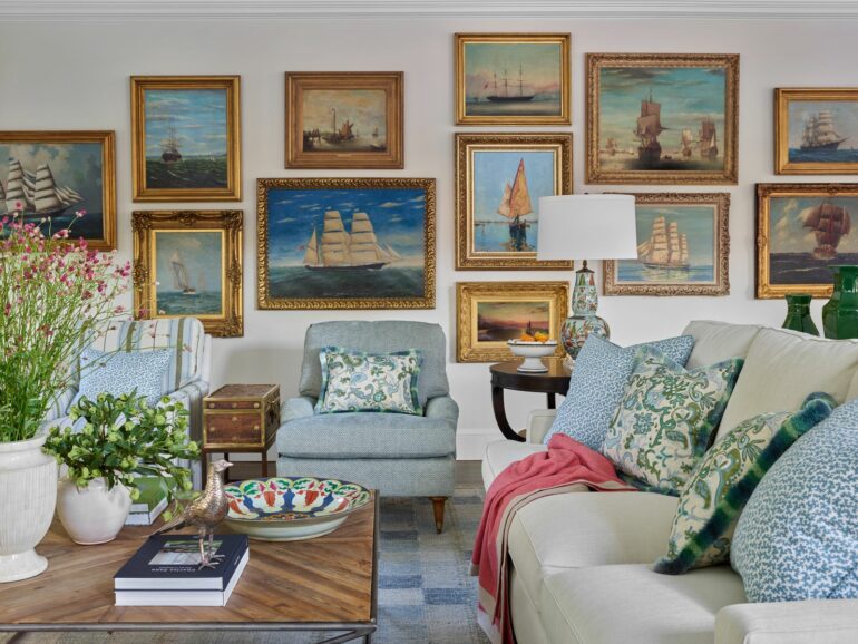
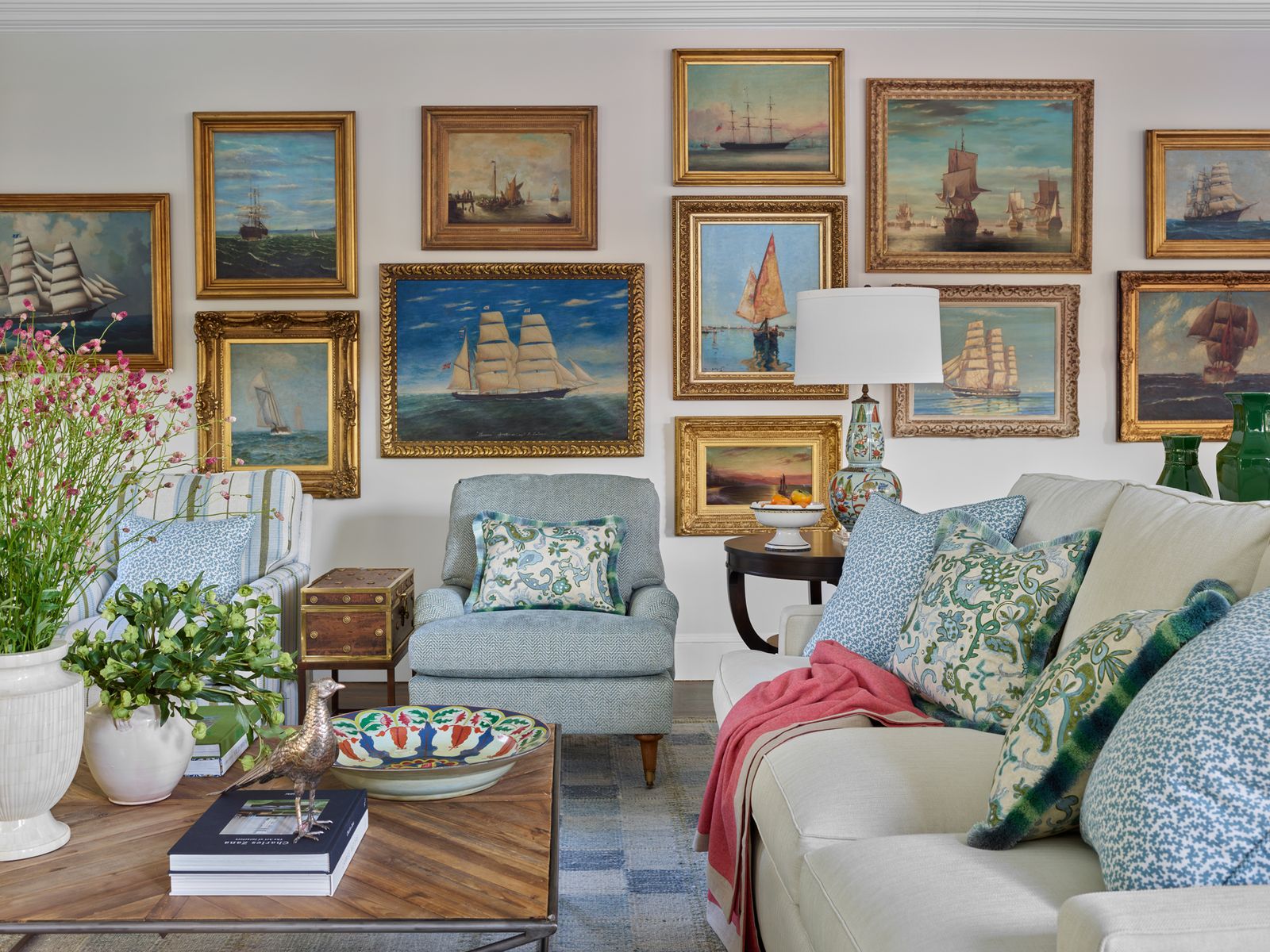
The clustering of frames on a single surface—often referred to as “Parisian-style” hanging or a gallery wall—allows for the display of a wide variety of formats, techniques, and finishes. While the final result gives the illusion of spontaneous abundance, its design requires rigorous planning. The goal is to treat the multitude of frames not as a series of individual pieces, but as a single macroscopic unit, possessing its own center of gravity and its own boundaries.

The coherence of such an arrangement depends on the consistency of the empty spaces. The distance between each frame must remain the same, regardless of the dimensions of the neighboring works. A gap of 5 to 7 centimeters is the standard measurement for maintaining visual tension. If the frames are too close together, they overwhelm one another; if they are too far apart, the composition falls apart and loses all impact. To master this puzzle, the most tried-and-true method is to cut out templates from kraft paper to the exact dimensions of the artworks. Placed on the floor and then secured to the wall with a light adhesive, these paper rectangles allow you to adjust the balance of the pieces, distribute the colors, and alternate between thick frames and thin moldings before drilling a single hole in the wall.
The Hanging Technique: The Illusion of Flatness
The final appearance of an installation depends heavily on the hardware used. The classic wire stretched horizontally between two hooks on the back of the frame has a major flaw: it pulls the top of the painting away from the wall, causing it to tilt forward. This tilt distorts the viewer’s perception of the artwork, catches the glare from ceiling lights, and casts an unsightly shadow on the plaster.
The solution adopted in high-end projects involves the use of two fixed anchor points. Two wall hooks, perfectly aligned using a spirit level, are inserted directly into two D-rings screwed onto either side of the frame’s back molding. This dual-anchor system literally presses the artwork against the wall, ensuring absolute stability and perfect flatness, even in the presence of drafts or vibrations. For delicate walls or exhibition spaces that are regularly reconfigured, the integration of discreet picture rails running along the crown moldings offers total flexibility without requiring any alterations to the wall finishes.
The Interplay Between Architecture and Light
The placement of a painting alters the physical perception of a room. Placing a narrow vertical piece at the end of a dark hallway acts as a vanishing point, artificially stretching the perspective. Conversely, grouping small-format works in an alcove enhances the sense of intimacy within that confined space. Interior designers use frames to highlight a traffic flow, mark a transition between a dining room and a living room, or break up the monotony of a long, featureless wall.
The choice of location depends on the light source, whether natural or artificial. Direct sunlight degrades pigments and inks, making it necessary to prioritize walls perpendicular to windows rather than those directly facing them. If directional spotlights or wall sconces are used to highlight the artwork, the angle of incidence of the light should be set at approximately 30 degrees. This specific angle ensures the canvas is illuminated evenly while avoiding the creation of a blindingly bright spot or casting the frame’s shadow onto the artwork itself. Finally, the process of hanging a painting culminates in this instinctive physical gesture: taking three steps back, letting your gaze take in the space, and verifying that the canvas seems as though it has always belonged on that particular wall.