Make Texture a preferred source on Google to support us
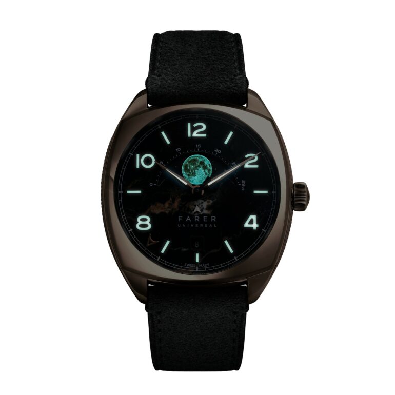
Add Texture to GoogleAt six o'clock, the moon occupies a circle measuring less than 6 mm. Yet it is the moon that redefines the look of the Farer Stratton II. The first Stratton had established itself in the brand’s moon phase collection, launched in 2023, and had enjoyed undeniable commercial success since October 2025. Its second edition does not seek to make drastic changes: it meticulously refines the most sensitive aspect of its design—the painted moon, which stood out a bit too sharply against the mineral density of the dial. Here, the moon gains depth, precision, and, above all, authenticity.
A complication scaled down to the size of a detail
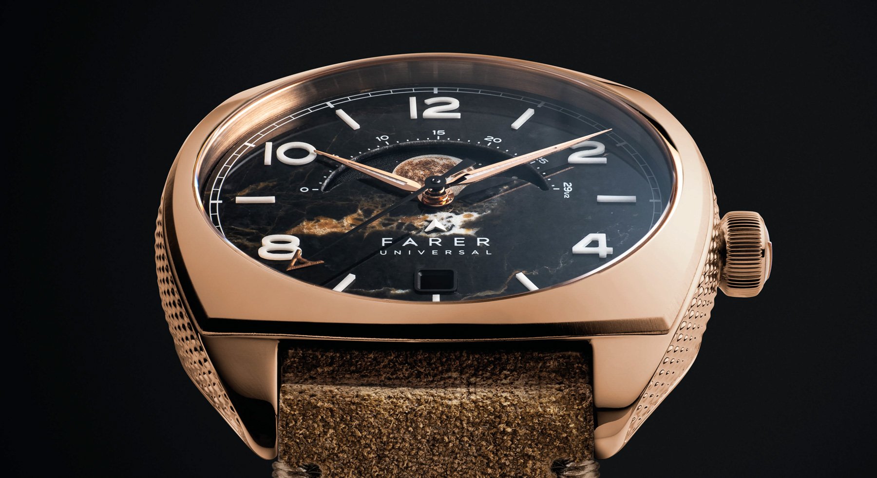
The moon phase is often treated as a decorative device, somewhere between vaguely celestial poetry and nostalgic graphic design. Farer takes a different approach with the Stratton II: turning this aperture into a window for observation. The new disc was created in collaboration with AJS Production, a Swiss specialist, using a laser micro-engraving technique. Several successive passes combine paint and Super-LumiNova to render a more realistic lunar surface, marked by nuances and textures perceptible at close range.
The result does not seek to create a spectacular effect from across the room. On the contrary, it calls for a familiar gesture from the watch enthusiast: bringing the wrist closer, tilting the case, and letting the light glide across the dial. This design choice is particularly well-suited to the Stratton II. Its charm does not lie in an object that imposes its presence, but in a watch that gradually reveals its materials, finishes, and design.
The disc retains its golden hue, in direct harmony with the gold PVD-coated case. But its new texture avoids an illustrative pattern. It lends a more cohesive depth to the overall design, without altering the rather unique personality of this moon phase model. The price increase, limited to 70 pounds compared to the launch price of the first Stratton, is largely attributable to this almost microscopic evolution.
The Dial as a Mineral Landscape
The watch’s true signature remains its black Eisenkiesel dial. This stone, whose German name translates to “iron pebble,” is a quartz veined with golden-brown streaks derived from iron compounds. On the surface, these veins create a marbled effect that never repeats exactly from one piece to the next. Farer thus does not offer a uniform black, but a shifting, almost geological material, where warm lines seem to emerge from the dark background.
This choice creates a natural harmony with the gold case. Where a lacquered dial might have made the overall effect too ostentatious, the stone absorbs and softens the reflections. The veins echo the tones of the metal, while the black retains a gravity that effectively frames the moon phase. This is also what sets the Stratton II apart from many watches with astronomical complications: here, the sky is not midnight blue or silver—it is mineral.
Farer draws on the visual language of the first version: applied Lumicast numerals and hour markers, polished and gold-plated spear-shaped hands, and a small seconds hand topped with Farer’s “A” in the same tone. A domed sapphire crystal, featuring an anti-reflective coating, protects this composition. On the back, a second sapphire crystal offers a view of the watch’s movement. Between the two, the model embodies an aesthetic that blends the warmth of gold, the natural irregularities of the stone, and the more technical precision of its displays.
A few tenths of a millimeter, the same spirit
The Stratton II has grown slightly in size. The diameter has increased from 38.5 to 39 mm, the thickness from 11.5 to 11.8 mm, while the length from lug to lug is now 45 mm, up from 43.8 mm. On paper, these differences exist; on the wrist, they should remain subtle. The watch retains a modest size, particularly for a model equipped with a moon phase display and a date.
Its cushion-shaped stainless steel case retains its key features: polished surfaces, a brushed bevel, and sides finished with Farer’s signature “grain twist” pattern. The gold PVD coating, therefore, does not cover a smooth, uniform surface; rather, it complements a play of textures that prevents the watch from looking overly opulent. The rounded steel crown, meanwhile, features a solid bronze cap stamped with the brand’s embossed “A” logo. While this detail is less visible than the moon, it reinforces the concept of a watch designed with layered materials.

Water resistance remains at 50 meters, or 5 bars, and the 20-mm lug width ensures full compatibility with the straps already available for the Stratton. Options range from black, brown, or gray suede to St. Venere leathers—available in fawn and black—as well as black Granolo leather or lion tan. All are paired with a gold PVD-coated stainless steel buckle. This continuity is important: the new edition does not require its owners to start over with a collection of accessories already built around the first model.
The Deliberate Choice of Manual Winding
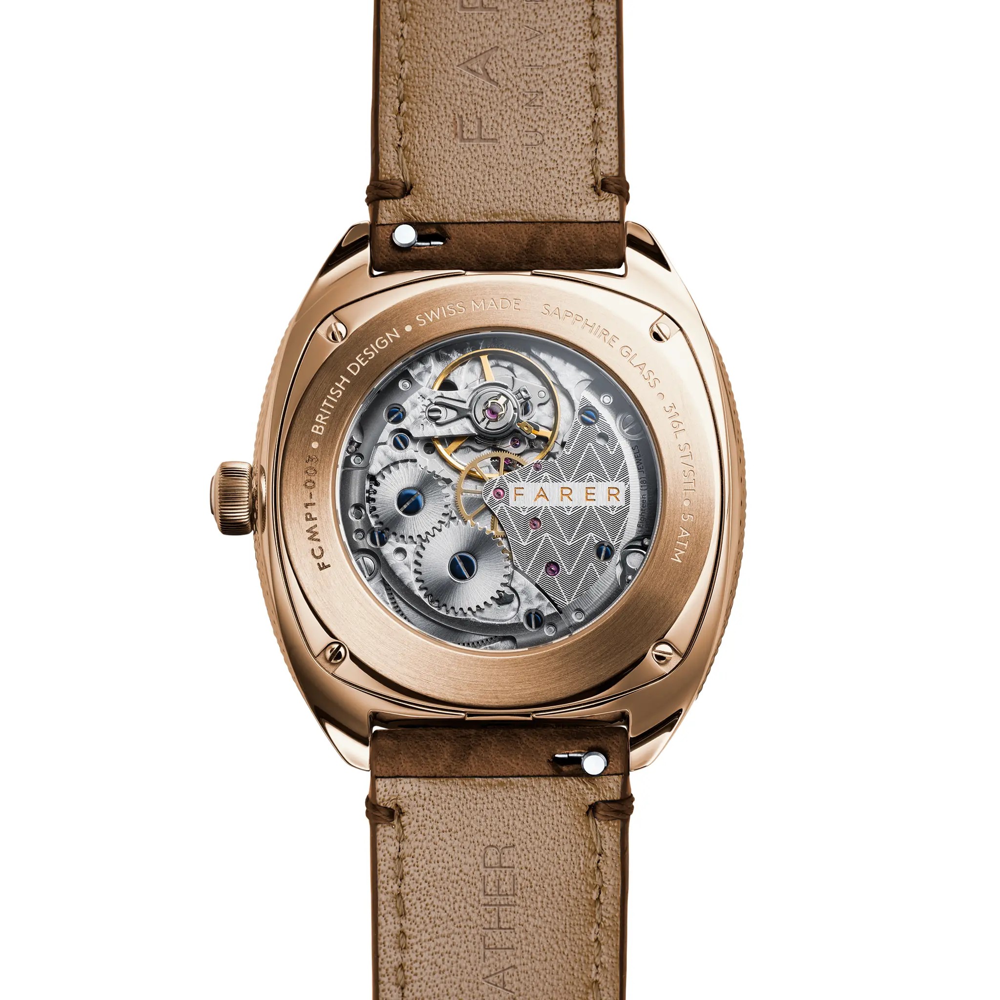
Rather than housing an automatic movement behind its transparent case back, the Stratton II retains the hand-wound Sellita SW288-1 M, in the “Elaboré” grade. Farer uses this movement across its entire moon phase collection. Beating at 28,800 vibrations per hour (4 Hz), it features 18 jewels and offers a 45-hour power reserve. Regulated in three positions, it is also equipped with an Incabloc shock-absorption system.
This movement combines hours, minutes, seconds, the date, and a moon phase display. The date is positioned at 6 o’clock and can be quickly adjusted; the seconds hand can be stopped while setting the time. These are functional features, but they take on special significance in a hand-wound watch: the Stratton II requires regular attention, without turning its use into a burdensome ritual.
The sapphire case back allows one to observe a custom movement without overwhelming it. The bridges feature Farer’s signature arrow motif, the screws are blued, and the surfaces are given a solage finish. This view from the back provides a mechanical counterpart to the spectacle of the dial. On one side, the stone and the miniaturized moon; on the other, the rational architecture of the Swiss caliber.
An evolution that avoids a radical break
Priced at 1,895 British pounds, the Stratton II changes neither the dial material, nor the movement, nor the bracelet system. It specifically addresses what might have caused hesitation with the first generation: the treatment of the celestial body at the center of the complication. It is a stylistic revision rather than a change in platform, and it is undoubtedly the right decision for a watch whose coherence already rested on the combination of Eisenkiesel and gold PVD.
The watch is available for pre-order on the Farer website. An initial batch of 100 pieces is scheduled to ship starting December 21, with further deliveries planned for 2027. For this second Stratton, everything comes down to a surface smaller than a fingernail: a moon now treated as a landscape, rather than a mere symbol.