Make Texture a preferred source on Google to support us
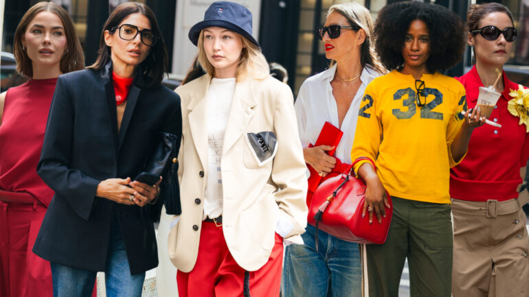
Add Texture to GoogleFrom the very start of the Spring/Summer 2027 fashion weeks, the streets set the tone. Even before the lights went out on the official runways, the areas surrounding the shows offered a clear indication: the eye now craves radical saturation. Marie Claire reporters first picked up on this buzz on the sidewalks of New York. Gone is the monopoly of concrete gray or protective black; guests took the streets by storm in shades ranging from tomato red to the purest scarlet. This trend was confirmed by the teams at Vogue, who noted the public’s magnetic attraction to these dazzling colors. Formal wear—the kind you wear to be seen before entering the venue—now serves as a visual signal. The streets have thus kicked off a season that refuses to apologize, while heralding a major shift: the end of absolute asceticism.
The Shattering of Minimalist Dogmas
The transition from the sidewalk to the runway confirms this shift with surgical precision. From New York to Paris, via Milan’s inevitable rigor and London’s eccentricity, the collections sweep away the notion of a monolithic trend. The fashion press observes a deliberate fragmentation of the designs. The pages of *L’Officiel* dissect an eminently diverse season, where the softness of muted hues unashamedly clashes with blocks of color of rare intensity. Metallic effects even collide with primary colors and pastels within the same wardrobe. The message sent by the designers is unequivocal: expanding the color palette does not spell the death of minimalism. Minimalism isn’t disappearing; it’s simply being forced to share the stage and engage with decidedly more extroverted designs. The range of choices available for 2027 has never seemed so vast, blurring the lines between the understated elegance expected of a daytime wardrobe and the opulence of an evening look.
To help navigate this abundant selection, the editorial team at Grazia has identified six shades set to define the summer look. Bright red, blood orange, Klein blue, aquamarine, olive chartreuse, and an extremely pale beige form the backbone of the season. Far from serving as a universal guide applicable to all fashion houses, this selection primarily highlights the importance of visual contrast. The trend adapts and evolves according to each brand’s identity, the weight of the fabrics, and the architecture of the cuts.
Red as Full-Body Armor
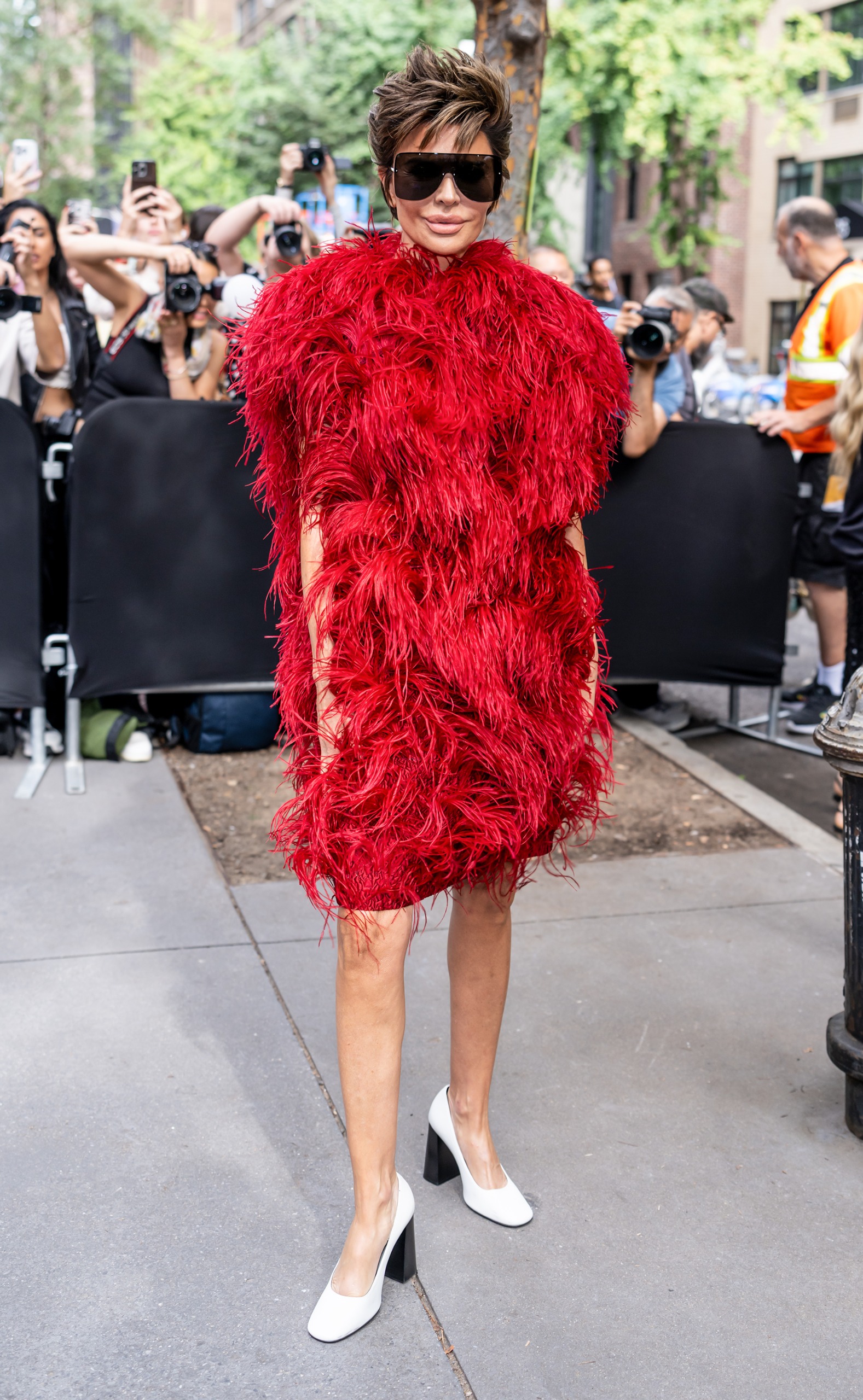
Among the colors dominating this stylistic lexicon, bright red stands out with unmistakable authority. The analysis provided by Who What Wear highlights a fundamental shift in how the color is used. Long confined to a supporting role—a lip, a heel, the handle of a bag—crimson now takes over the entire silhouette. On the runways, it appears in full ensembles, making a bold statement. This convergence between analyses of the official collections and observations of runway guests proves that bright red is no longer a theoretical concept, but a reality embraced by the industry.
Alongside it, blood orange offers a subtly different alternative. This dense, deep reddish-orange demands an entirely different approach to the fabric. Designers use it to highlight texture. It finds its fullest expression when it catches the light on particularly lightweight knits or when it complements the movement of a flowing dress. The boldness of the hue is softened by the fluidity of the drape. The challenge with this shade lies less in imposing a strict uniform than in mastering the balance. It is the intensity of the color that dictates the proportions of the garment, proving that the impact of a piece of clothing often hinges on a single thread.
Shock Waves and Ultramarine Depths
The chromatic exploration of 2027 also ventures into aquatic and pictorial territories. Klein blue—that ultramarine of abyssal depth—emerges as a major accent in numerous collections. During New York Fashion Week, Who What Wear specifically documented the ubiquity of cobalt. Far from being relegated to the background, it often serves as the focal point of the outfit. Its adaptability is fascinating: set against stark white, the blue takes on an almost clinical sharpness, evoking the seaside aesthetic of a sleek yacht. Conversely, when a touch of black clashes with it, it instantly shifts to a much more dramatic, nocturnal, and theatrical mood.
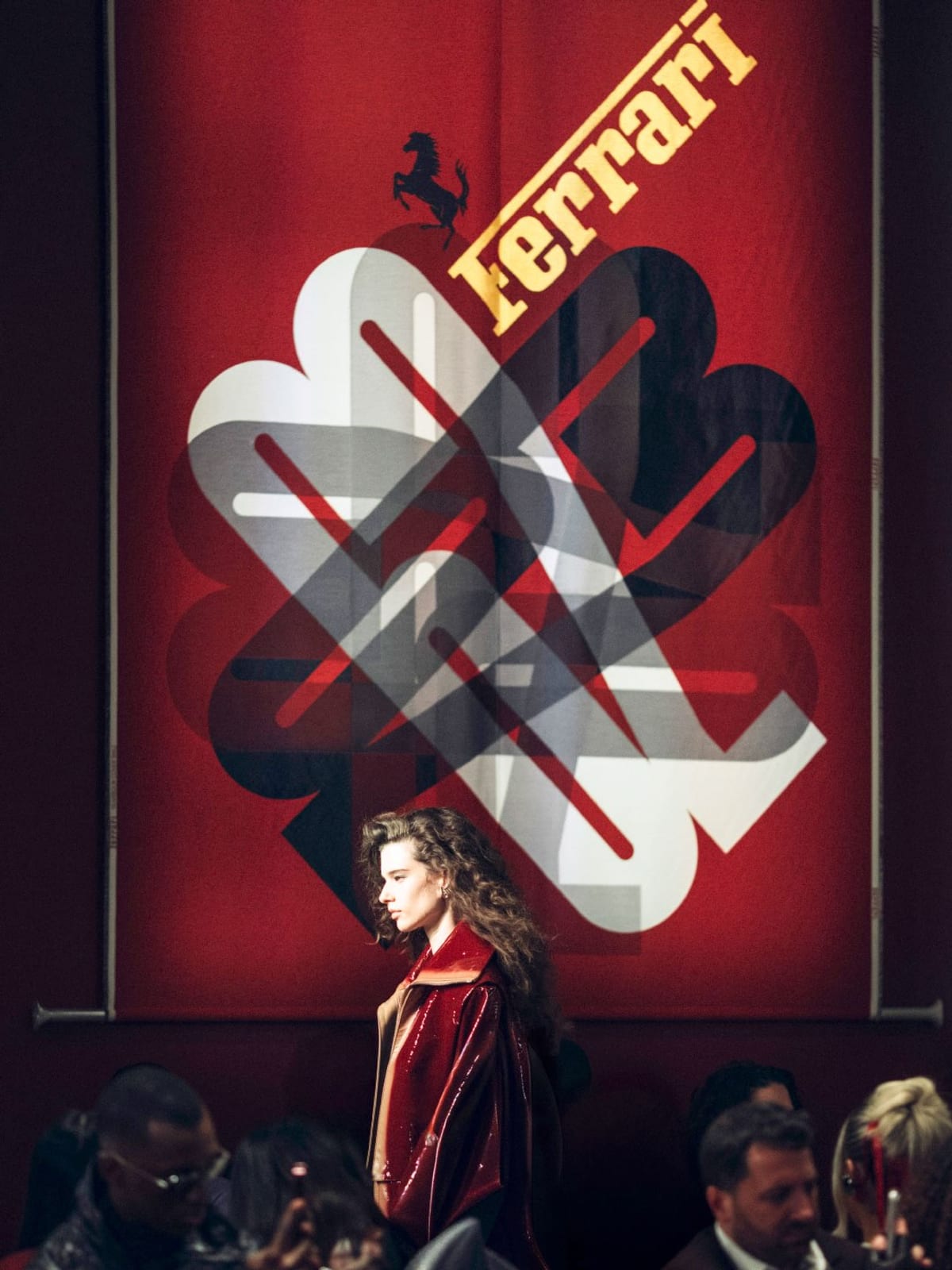
In a similar vein but bathed in a different light, aquamarine redefines the approach to summer hues. Moving away from the nostalgia of washed-out pastels, this green-infused variation captures the saturated intensity of turquoise waters. Its use demonstrates the striking impact a color can have when it covers large swaths of fabric. It radically shifts the visual balance of a silhouette, proving that a choice of color is never neutral. The visual impact of these bluish expanses reminds us that color possesses its own spatial architecture.
The Rise of Subversive Neutrality
The 2027 wardrobe refuses to rely solely on primary colors to make a lasting impression. The industry is reinventing its relationship with subtlety through hybrid and unexpected shades. Chartreuse, known by the evocative name “dirty martini,” perfectly illustrates this approach. This very specific yellow-green, deliberately murky, takes the place traditionally occupied by military khaki or safari green. It retains a basic function—to complement the rest of the wardrobe—but introduces a new sense of intrigue. Paired with deep chocolate brown, ivory, or slate gray, this chartreuse exudes formidable sophistication, infinitely more complex than a simple earthy tone.
At the opposite end of the spectrum, to reassure devotees of “quiet luxury,” beige is making a measured comeback. But this is a bloodless, very pale beige that subtly oscillates between the matte quality of bone, the warmth of sand, and the depth of taupe. It stands out clearly from pure white—which is too harsh in the sun—or cream, which can sometimes feel too predictable. It offers a way out for those who wish to escape the dazzling brilliance of color without falling into boredom. This peaceful coexistence confirms that the season does not seek to pit color against simplicity. Each approach retains its legitimacy, allowing extremes to coexist on the same runway without a single misstep.
Crafting your look for Spring/Summer 2027 will therefore require an almost mathematical approach. The challenge will no longer be to check off items on a color list dictated by fashion houses, but to determine the role of each shade on the body. A decision will have to be made: will a particular shade serve as the centerpiece, a jarring element of contrast, or a simple, understated accent? By throwing open the doors to its chromatic palette, fashion has not sacrificed its classics. It has simply given beige the right to look the boldest shades straight in the eye, without ever fading into the background.