
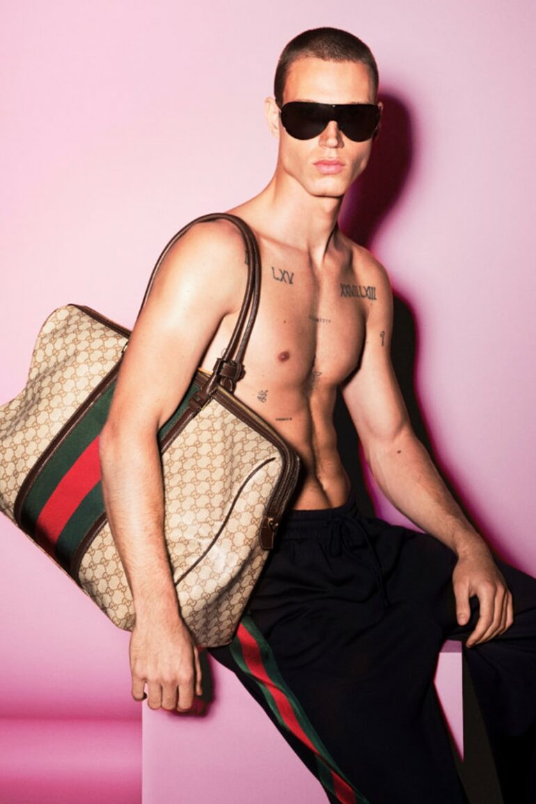
The gaze wanders beyond the frame, absorbed in a thought we cannot fathom. The faces appear isolated, almost detached from their surroundings, captured in a moment in time that seems free from any sense of urgency. For its Fall-Winter 2026 eyewear campaign, the Italian fashion house Gucci imposes an unexpected visual silence. The frenzy that often characterizes luxury imagery gives way here to a deliberate stillness, where each subject moves at their own inner pace. Curiously, the object itself almost fades into the background in favor of attitude. Eyewear is no longer viewed as a mere seasonal accessory but positions itself as a subtle clue, a silent key to understanding the personality of the wearer.
This photographic approach prioritizes inner depth over exuberance. The atmosphere—confined and introspective—rejects the spectacular to focus on the essentials: line, shadow, and structure. The endeavor is all the more challenging given that the fashion industry generally thrives on visual excess. But here, the focus narrows. The glasses return to their primary function: to frame a presence, to filter the outside world while affirming an intimate stance.
A Break with Minimalism
To gauge the uniqueness of this artistic direction, one need only look back a few months. The Spring/Summer 2026 campaign took a diametrically opposite approach. The imagery made a strong impact, favoring extremely close-up portraits that saturated the visual space. The shapes were oversized, embracing a strikingly bold geometric aesthetic with sharp cat-eye silhouettes or volumes directly inspired by aircraft designs. The details fiercely caught the light: sparkling touches of crystal, gold-plated bamboo inserts, and ostentatious references drawn unreservedly from the house’s archives. The tone was one of extroversion, a demonstrative reinterpretation of historical heritage.
The Fall-Winter 2026 collection thus marks a radical shift. Gone are the immediate visual shock, the strategy of glitz, and the fleeting stylistic whims. The transition from one season to the next illustrates a desire to tone things down, to replace bling-bling with the elegance of restraint. The silhouettes step back from the spotlight, space breathes again, and the frames shed their glittering embellishments to rediscover a form of structural simplicity. This is not a rejection of the archives, but a much more serene way of embodying them.
Black acetate: the new language of intimacy
The eyewear collection highlighted in this new photographic series revolves around pieces that refuse to compromise. Acetate once again takes center stage, crafted in its deepest and most definitive shade: deep black. One of the season’s flagship women’s models perfectly illustrates this dynamic. The frame, substantial without being overpowering, simply accentuates the eyes with relentless geometric precision, interrupted only by the presence of the double G in metal.
The design of the sunglasses follows this same logic of subtraction. A round sunglass frame, available in absolute black, draws the eye not through its volume but through its conciseness. The temples feature subtle hints of the Horsebit motif, proving that the brand doesn’t need to overhaul its design vocabulary to offer a refreshed aesthetic. The men’s line extends this approach with designs that embrace classicism. The black rectangular sunglasses stand out as the absolute staple for the colder season—a piece of minimalist architecture that doesn’t seek to draw attention. The men’s prescription glasses, also crafted from dark acetate, embrace formal simplicity—a modernity free of any frills.
Alongside these dense, solid blocks of black, an alternative emerges through the delicacy of metal. Rounded, more understated models reveal temples where the metal intertwines to recreate the iconic “horsebit” design, bringing a structural lightness that contrasts with the thickness of the acetate, all while maintaining that same commitment to understated elegance.
Preserving the legacy: risk and balance
Managing the legacy of a historic house is always a balancing act. The double G, the bamboo, and the Horsebit are not mere aesthetic details; they constitute the brand’s DNA, its immediate visual cues, and its indelible signatures. At a time when the luxury market sometimes exhausts itself in the pursuit of radical novelty every season, the temptation is strong to either discard everything or overuse these emblems to the point of saturation.
The danger inherent in these powerful symbols is well known: taken to extremes and plastered everywhere indiscriminately, they transform the frame into a mere status symbol, reducing the design to a simple advertising medium. The item then loses its intrinsic desirability, becoming nothing more than an ostentatious totem—at the expense of the physical pleasure of wearing it and making it one’s own.
It is precisely this pitfall that this winter’s campaign carefully avoids. The distinctive symbols are certainly present, but they function as familiar punctuation rather than as the main subject of the sentence. They anchor the collection in a reassuring sense of continuity. By fully embracing this historical vocabulary—yet refining it and applying it with infinite care—the artistic direction proves that the familiarity of a design language in no way diminishes its relevance when applied with precision.
Through these faces lost in thought and these frames reduced to their purest form, the message goes beyond a simple sales pitch. This approach reminds us that, beyond its protective function, the eyeglass frame remains one of the few fashion items that sits directly on the face, instantly altering the geometry of one’s features and the impact of one’s gaze. They are not just for seeing; they determine how we are perceived, drawing an intimate boundary between ourselves and the rest of the world.