
Make Texture a preferred source on Google to support us
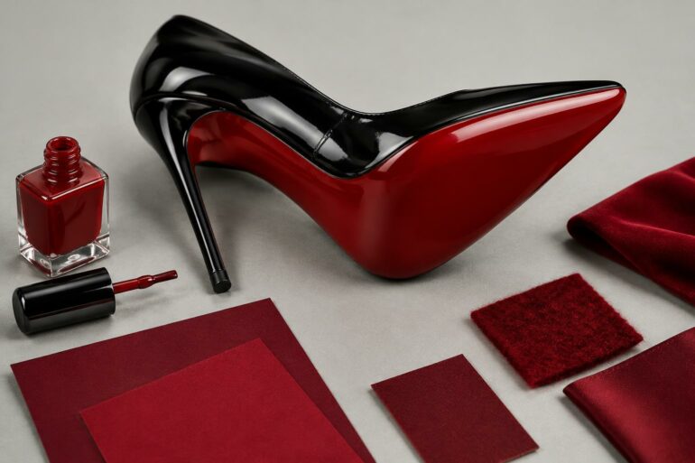
Add Texture to GoogleRed flashes across the asphalt for half a second, in time with hurried footsteps on the sidewalk. Beneath the sole, the exact shade—Pantone 18-1663 TPX—needs no logo. A mere fraction of the light spectrum is enough to evoke the world of the Parisian shoe house founded by Christian Louboutin. In the highest echelons of design and craftsmanship, color operates far beyond mere aesthetics. It constitutes a protected territory, a formidable legal weapon, and a language in its own right. It bypasses the cerebral cortex to impose a brand’s identity even before the eye has had a chance to decipher its name.
The visual saturation of our era is shifting the front lines. The grain of leather or the cut of a coat requires close inspection to be judged. Chromatic identity, on the other hand, makes an impact from a distance. It acts as the load-bearing wall in the architecture of a prestigious brand.
A Historical Anomaly Turned into Dogma
Yet one of the most powerful colors on the market is by no means the result of a strategy carefully crafted by an executive committee. Hermès’s signature orange was born out of a drastic stock shortage. During the Occupation, supplies in Paris collapsed. The boxes lined with glossy brown paper and edged with a thin gold trim disappeared from the shelves on Rue du Faubourg Saint-Honoré. Émile-Maurice Hermès’s supplier had only one option left in his warehouses: a textured paper in a bright orange—rough and almost jarring by the discreet standards of the bourgeoisie at the time. Out of sheer necessity, to continue serving its customers, the saddlery adopted it.
What began as a mere stopgap measure evolved over the decades into an unshakable pillar of the brand’s identity. Today, this orange cannot be described by a conventional CMYK code; it is experienced as a physical reality. The box itself, with its distinctive texture and brown ribbon, draws as much attention as the object it contains. This historical coincidence crystallized a visual signature that defines the entire network of boutiques worldwide. Interior designers play with this shade through subtle or bold accents, reminding us that the history of luxury is sometimes written through pure material constraints.
The spectrum of light under judicial seal
While some inherit a color, others capture it, measure it, and lock it away. As early as 1845, the American jeweler Charles Lewis Tiffany selected a turquoise blue, similar to the shell of a blackbird’s egg, for the cover of his annual mail-order catalog, the Blue Book. The choice stood in stark contrast to the prevailing academic style and the dark velvets of nineteenth-century European jewelry.
Intellectual ownership of a color, however, requires scientific rigor coupled with a legal arsenal. The Pantone Institute worked closely with Tiffany & Co. to develop a custom shade, simply named “1837 Blue” in reference to the year the company was founded. This shade does not appear in any published color chart. An outside printer does not have access to its exact formula. This privatization of a light spectrum illustrates the industry’s obsession with absolute exclusivity.
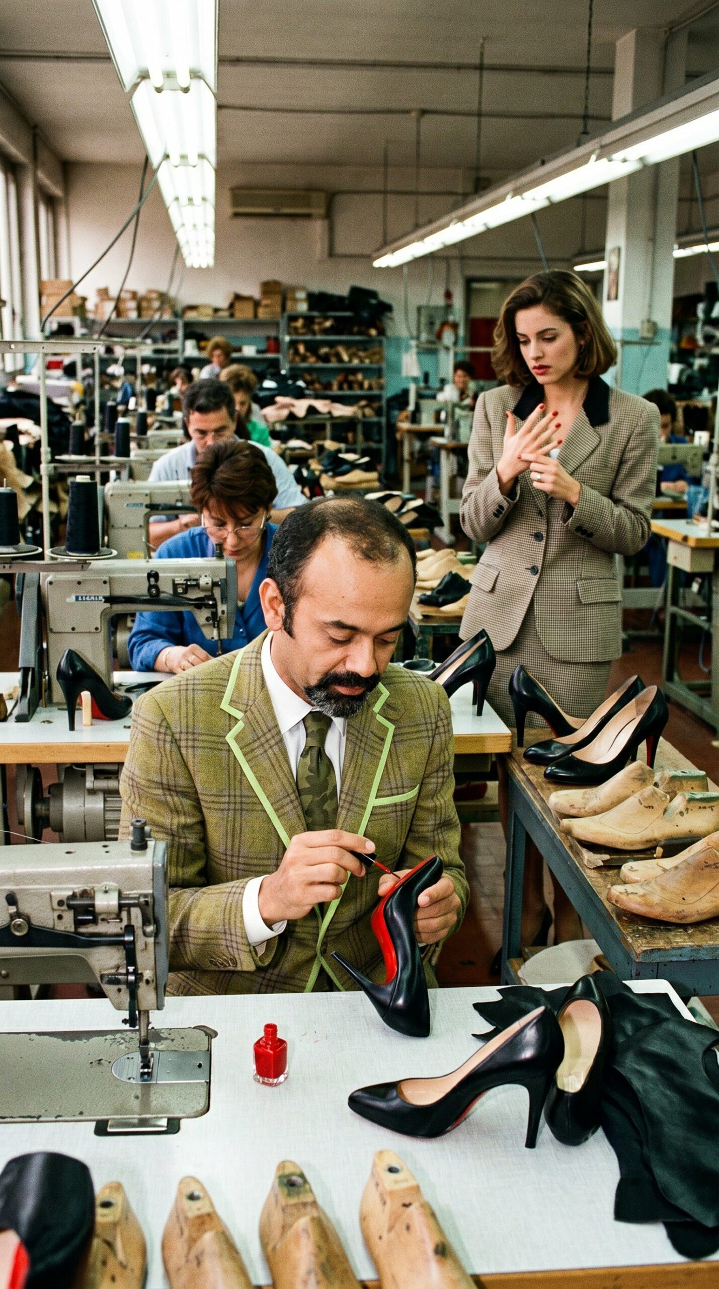
Legally speaking, the battle involves entire law firms. In 2012, Christian Louboutin waged a fierce legal battle in U.S. courts against Yves Saint Laurent, which was offering a shoe that was entirely red, including the sole. The U.S. Court of Appeals for the Second Circuit in New York ultimately ruled that the bright red sole is indeed a registered trademark, with the sole exception of cases where the entire shoe is made in the same shade. The law is seeping into the world of pigments. A shade of color becomes an intangible asset that must be defended tooth and nail.
The obliteration of form through total saturation
The manipulation of the color palette sometimes takes on radical dimensions, verging on a contemporary art installation. Pierpaolo Piccioli, during the presentation of the Fall-Winter 2022–2023 collection, orchestrated a deliberate erasure of volume through the exclusive use of fuchsia pink. “Pink PP,” developed in collaboration with Pantone, swallowed everything in its path: cashmere coats, chiffon dresses, the platforms of the shoes, the monumental decor of the Carreau du Temple in Paris, right down to the asphalt on which the models walked.
By reducing chromatic distraction to a single light frequency, the creative director forces the eye to focus on the line, the cut, and the texture of the fabric. The color acts as a leveling filter. This strategy of total saturation directly addresses the logic of image consumption. A neon pink square on a screen captures attention, halting the viewer’s instinctive scrolling. The hue asserts itself as an aggressive, unapologetic beacon, signaling affiliation with a specific aesthetic while breaking free from traditional lettering.

The technical challenge of material consistency
Beyond the symbolism, mastering a signature color conceals a true industrial feat. Faithfully reproducing Cartier’s deep, bronze-tinged red on morocco leather, glossy paper, the lacquer of a pen, or the enamel of a watch dial is a chemical conundrum. Each material absorbs and reflects light according to its own characteristics. A dye that produces a vibrant hue on a square of silk will appear dull or yellowish when applied to calfskin.
The manufacturers’ laboratories conduct a series of tests under different light sources—zenithal daylight, neon, incandescent—to ensure that an apple-green bag does not turn khaki depending on the lighting in a Tokyo or New York boutique. Dyers adjust the dye baths to the nearest gram, accounting for the natural porosity of the hides or the transparency of the polymer resin. Color consistency demands a level of quality control that automatically rules out under-equipped workshops. Achieving the perfect shade requires colossal budgets—not because of the cost of the raw pigment, but due to the research time needed to guarantee its strict consistency across dozens of different substrates.
The psychological impact of a new color palette
New artistic directions are breaking into uncharted territory to set their own pace. The emergence of “Parakeet Green” at Bottega Veneta, under the leadership of Daniel Lee, proved that a brand could make an unexpected color its own in record time. A bold, almost synthetic green, applied to the iconic Intrecciato woven leather, on massive packaging boxes, and on the facades of international pop-up stores. With no visible logo on its creations, the Italian brand used this burst of color to make a bold statement in the urban landscape.
Anyone who spots this specific shade on a passerby’s arm immediately recognizes the item’s origin. This mechanism is akin to Pavlovian conditioning applied to design. The brain associates pure visual information with a world of price, craftsmanship, and social status, instantly assessing the item’s value.
Chemistry dictates the rules of desirability. Manufacturers market patented light spectra, fiercely defended in court and scrutinized under full-spectrum lamps. In the dyeing workshops of Aubervilliers or Scandicci, artisans no longer simply color a material—they calibrate an optical signal. The commercial battle is fought over the physical impact of a wavelength on the retina, reducing the logo’s presence to a mere footnote.