
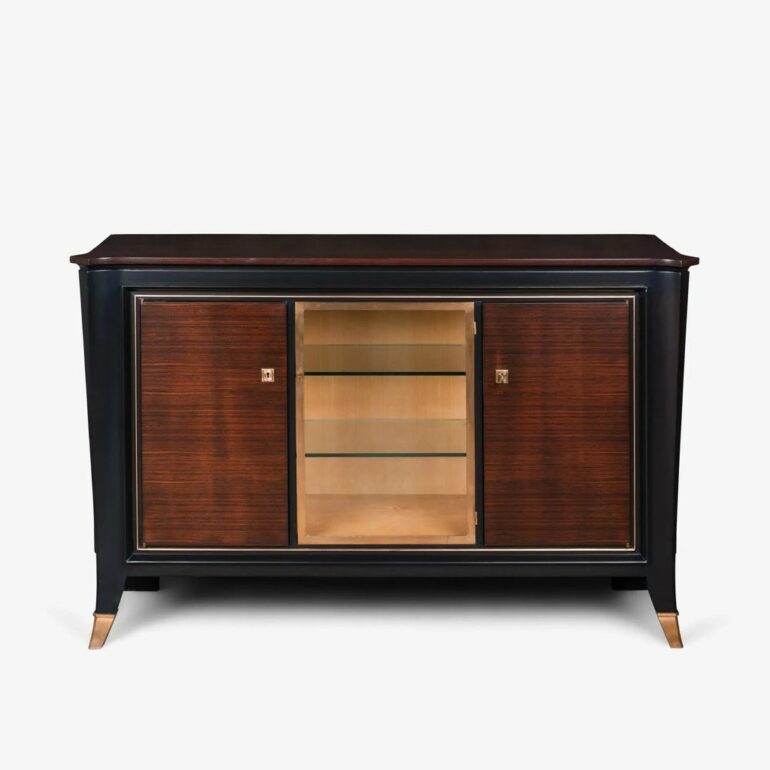
Make Texture a preferred source on Google to support us
Add Texture to GoogleThe straight line took its revenge on the arabesque. After the exuberant plant motifs, organic curves, and the sometimes suffocating opulence of Art Nouveau, the aesthetic of the 1920s imposed a new kind of rigor. The time was no longer for copying nature, but for taming it. Fueled by the effervescence of the interwar period, a need for order and a thirst for modernity took hold of interior design. The International Exhibition of Modern Decorative and Industrial Arts, held in Paris in 1925, gave its name to this movement, which would redefine the contours of luxury. This is not a matter of austere minimalism—quite the contrary: opulence remains, but it is now channeled through geometry. Understanding and embracing this aesthetic today requires a certain boldness, for this style tolerates neither approximation nor half-measures.
The Joyful Tyranny of Geometry
If one were to summarize the spatial approach of this era, the term “symmetry” would immediately come to mind. Space is organized around strong axes, creating clear perspectives. The patterns adorning walls, textiles, and furniture facades obey strict mathematical rules. The chevron pattern, the fan, the half-moon, and the radiating sun (the famous sunburst) replace flowers and vines. Stepped forms, directly inspired by Mesopotamian ziggurats and Aztec temples—which had recently been rediscovered—can be found in the architecture of North American skyscrapers as well as on the base of a desk lamp or the pediment of a cabinet.
Bringing this dynamic into your home involves incorporating pieces with sharp, defined lines. A sofa doesn’t flare out; it forms part of a solid block. A mirror isn’t merely round or rectangular; it’s beveled, framed in ribbed metal, or fragmented into several faceted panels. On the walls, wallpaper plays on hypnotic repetition. Scales, diamonds, and cubic interlacing patterns appear with metronomic regularity, creating a visual rhythm that instantly lends grandeur to even the smallest room.
The Cult of Rich Materials
The golden age of the Roaring Twenties was marked by a fierce appetite for rare, heavy materials of the utmost preciousness. Industry was advancing, speed was a source of fascination, and furniture took on the same attributes as the great transatlantic liners or the sports cars of the era. Wood was no longer displayed in its rustic simplicity. It was exotic, dark, and precious. Macassar ebony, burl elm, mahogany, and rosewood were crafted into veneers to highlight the natural pattern of their grain, often polished to the extreme until a mirror-like finish was achieved.
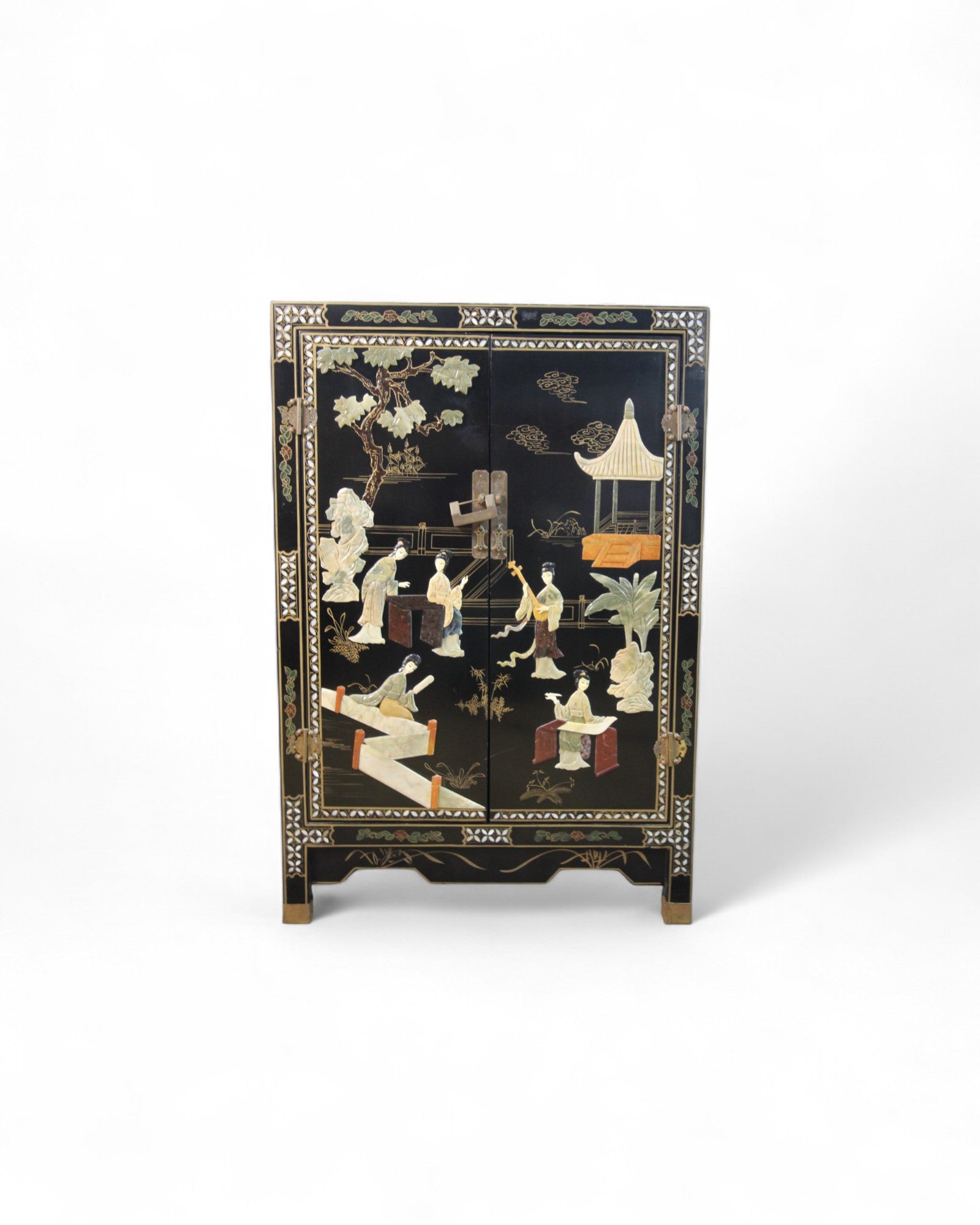
The dark warmth of these woods is offset by the cool brilliance of metal. Brass, chrome, bronze, and stainless steel define the structure of seating, table legs, and hardware details. These metallic accents act as focal points in the decor. At the same time, more unexpected textures make their appearance. Shagreen (the pearly-grained skin of a stingray), parchment, Asian lacquer applied in dozens of layers, and even straw or tortoiseshell marquetry adorn console tables, cabinets, and screens. If you want to infuse this atmosphere into a contemporary living room without resorting to exorbitantly priced antiques, the secret lies in tactile contrast: pairing the smooth coolness of a black or Portoro (gold-veined) marble tabletop with the thick, plush texture of a corduroy seat.

A Dramatic Color Palette
Intensity reigns supreme when it comes to color. Avoiding pastel tones or overly rustic earthy shades, the palette focuses on deep hues capable of complementing the brilliance of gold and chrome. Midnight blue, emerald green, burgundy red, amethyst purple, and lacquered black form the chromatic backbone of these interiors. These saturated hues absorb light and lend the space a subdued, almost cinematic atmosphere, reminiscent of 1930s smoking rooms or private clubs.
To avoid a heavy, oppressive effect, these dark colors are consistently enlivened by flashes of metallic sheen. Gold—whether matte, brushed, or glossy—is not used as a background color but as an accent. It highlights a cornice, borders a rug, or illuminates a lamp base. Pure white or cream also serve as a counterpoint, often through checkerboard floors, frosted glass light fixtures, or alabaster sculptures, creating sharp contrasts in light and shadow. On the floors, thick rugs with cubist patterns often combine ochre, black, and a powdery pink or teal, physically defining the reception area.
The Balance: The Key to Reinterpretation
There is a fine line between a stylistic homage and a movie set. Recreating a 1928 living room exactly as it was risks freezing the space in museum-like nostalgia. The challenge of contemporary integration lies in fragmentation. It’s about extracting the very essence of that era and juxtaposing it with our current design vocabulary.
A wrought-iron console table with clean lines and a club chair with contoured armrests are enough to set the mood, especially when placed on a rough-hewn herringbone parquet floor, devoid of the glossy varnish of yesteryear. Lighting remains one of the most effective ways to instill this tension. Wall sconces made of ribbed brass that cast light toward the ceiling, or opaline glass globe pendants suspended from rigid rods, instantly alter the perception of a space. The goal is to impose a sense of discipline on the eye. A wallpaper featuring golden geometric patterns applied to a single wall, echoing a coffee table where smoked glass meets steel, establishes this dialogue between the shadows of dense materials and the radiance of tamed light.